VAITI
Product Designer
•
Startup
•
2026
Designed from scratch the interfaces and logic of a career service, combining
job search, company catalog, interview trainer
and tools into a single workspace. Built a unified design system that tied the services together and prepared the product for rapid launch and further growth.
job search, company catalog, interview trainer
and tools into a single workspace. Built a unified design system that tied the services together and prepared the product for rapid launch and further growth.
About the project
VAITI is a job-tech startup for finding work in IT. A single platform instead of a dozen services: job listings, company catalog, skill development, and application tools.
My role
Joined the team when there was no designer. The product was being built collectively — the interface lacked a unified logic. I translated business ideas into working screens and sought the balance between business goals and user experience.
What I did
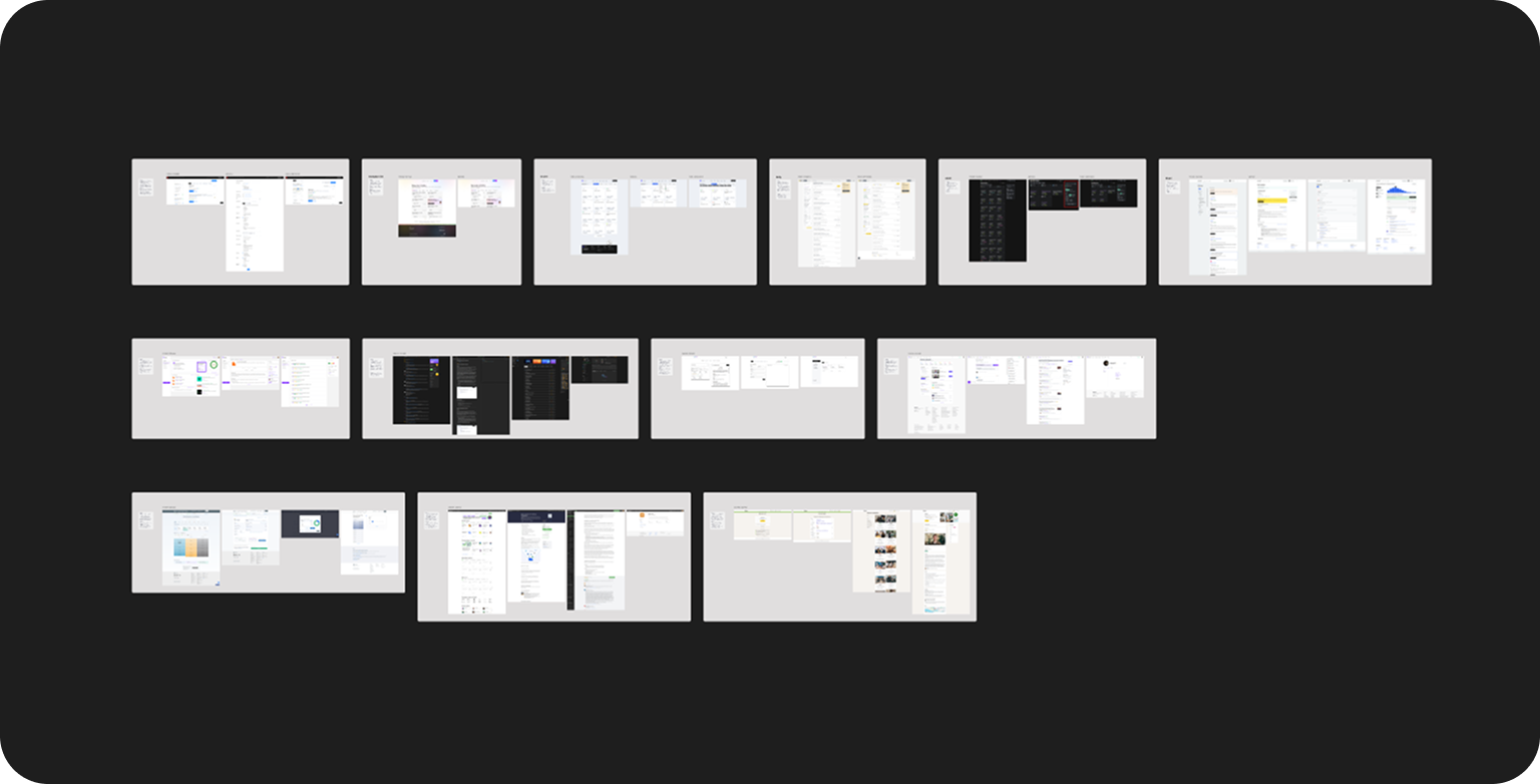
Took full ownership of design: reviewed existing work, mapped out the key user flows, and laid the foundation of the interface system.
Research
Constraints
The project was at the MVP stage, so spending too long in research wasn't an option: the team needed to move quickly to interfaces and push the product into development.
Competitors
Conducted a quick analysis of direct competitors (search results, filters, cards) and indirect ones (interviews, resumes, skills). Documented weak spots and common patterns.
Users
Understood the target audience from the inside — had recently been job hunting in IT myself. Plus hallway usability tests with developers: observed where the logic didn't come across as intended.
Job Aggregator
The first module — where the overall logic was shaped and the UI kit was established. I wanted to create a calm space without pressure. Soft gradients reduce tension; the focus stays on content.
Key decisions
One job per row
Dropped the two-column layout after research: when searching, calm reading matters more than density. Columns created visual noise where focus was needed.
Matched jobs instead of filters
Smart resume-based matching was brought to the foreground; manual filters were tucked behind a button. The interface became lighter and the search faster.
Shortlist and compromise
The business wanted to make the short-list the only way to apply. The plan was for users to save a job, go to the list, and trigger auto-apply. However, this feature only worked through plugins and integrations, which would lead most people into a dead end. I suggested keeping the direct apply button as the main action, and making the short-list an extra option for those who want to collect jobs and apply all at once. We agreed on this solution.
Job detail page
The business wanted to expand job info directly in the list. I insisted on a separate page — without it, the feed would turn into chaos. The page includes: full description, the primary action "Apply at source", company rating and recruiter contacts side by side.
Swipe mode
An alternative mode absent from the Russian market: instead of a list — swipeable cards. Only the essentials for a quick decision: employer, position, salary, tech stack. Switching between modes is prominent, with a remaining-jobs counter alongside.


Result
This section became a fully-fledged workspace for job seekers. I managed to consolidate the complex search process into one coherent system where all job-hunting tools now live in one place.
Company Catalog
There was no company catalog in the product — just a , grouped by category. I rebuilt it into a full-featured section with cards, filters, and search.
Key decisions
Two columns
People browse companies differently from jobs — they scan rather than read. Two columns speed up comparison without overloading the screen.
Company card
Only what's needed for an initial assessment: industry, description, tech stack, hiring rating, and recruiter contacts.
Targeted search and filters
Added name-based search and filters by key parameters: technologies, company size, and field of work.
Reviews
A form that collects interview experience details: meetings, test assignments, topics, and specific questions asked.
Result
The catalog covers the MVP goals: find a company, get a surface-level overview, reach out to contacts. The interface is ready to scale.
Skills Catalog
This section addresses the uncertainty faced by candidates who often don't understand their actual level or market expectations. Here, the user simply selects their field and immediately gets a complete, clear map of requirements.
Key decisions
Grades
Flexible block structure: the section can be easily adapted to any IT profession via the admin panel.
Salary
Data is hidden — it unlocks once you share your own. A database built on real numbers.
Related technologies
You can explore a technology in depth right within the section, without switching context.
Technical question bank
Questions organized by topic and grade — filter by your level and prepare without searching the internet.
Result
This section fully addresses the core need — understanding market requirements and determining your own level. At the MVP stage it works as a convenient reference and self-assessment tool. Later, the skills map can evolve into a personal career navigator.
Interview Preparation
This section helps candidates practice technical knowledge before a real interview. At the MVP stage an interview trainer is implemented; online testing and a sandbox are planned as next development phases.
Key decisions
Recent sessions
Surfaced the history of recent practice sessions on the section's main screen. This lets users instantly pick up where they left off.
Results
I designed the results screen so users can immediately review their mistakes. The system clearly highlights which answers were correct and which were not.
Result
This section helps candidates gauge their readiness before entering the market. Only the interview trainer is live in the product for now, but the interface is already ready for new features to launch.
Cover Letter
This section removes the routine from the job application process. The interface's primary goal is to help candidates craft a text that perfectly connects their experience to the requirements of a specific job — in just a couple of clicks.
Key decisions
Source flexibility
At the MVP stage the tool only works from the VAITI catalog. But I designed the logic from the start so the system isn't tied to a single source. If a user found a job on another site, they can simply copy the description and paste it in manually.
Focus on the final action
I designed the final screen so users can immediately get the result of their work, copy it, or download it.
Result
The user gets a letter in just a couple of clicks. The flexible data-input solution worked around the MVP's constraints.
Resume Improvement
This section helps candidates find errors in their resumes and fix them. It allows users to refine their resume so it passes automated screeners and appeals to real HR managers — while giving users control over which changes to accept.
Key decisions
Change control
No blind "apply all". Suggestions grouped by category: structure, achievements, ATS. Every edit presented as "before / after".
Inline editing
The editor is built into the card: if a suggestion isn't quite right, it can be corrected right there.
Sticky panel
A floating panel at the bottom: a counter of selected improvements and an apply-all button.
Recruiter-approved template
The template was signed off with a recruiter — the document is generated in exactly the format they want to see. Download or save to profile from here.
Result
From blind generation — to collaborative editing. The tool highlights areas for improvement while the final say always belongs to the user.
UI Kit
The project's design system was built with an emphasis on development speed and ease of maintenance. Components are adapted for the frontend to eliminate misunderstandings during implementation.

Base styles and states
I locked in all rules from the start: from brand gradients to spacing and typography. For every element I drew a clear state grid.
Components built to grow
All elements in Figma are organized so the product can be easily expanded later. When the team decides to add new sections in the future, they won't need to redraw the base patterns.
Conclusion
I managed to turn a shared idea into a coherent structure and set of interfaces, maintaining the balance between business objectives and value for candidates. I established the logic and rules by which the product can continue to grow.
The project is currently in development. I fully prepared and handed off all deliverables to the team — from user flows to a responsive UI Kit — creating a solid foundation for a fast build.