Designed an employee profile card as part of a digital work platform: from quick contact previews to a full profile with tasks, projects, skills, achievements, and work history.

Task
Formally, the
only required a basic UI component for an employee card.
But I
decided not to design it in isolation, since that would not let me
fully step into the user’s context. Instead, I designed the context
around it — the digital platform itself. This made it possible to work through real interaction scenarios and embed the card into a
living work environment.
Research
I needed to understand how employee cards are connected to the workflow in these services: where employees are displayed, how quickly the data can be read, what is shown upfront, and what is hidden deeper in the interface. So I analyzed competitors to identify the strengths and weaknesses of their interfaces.
Competitor Analysis
I wanted to understand two things: how similar products handle employee cards, and what information users actually need in a work scenario.

Conclusion
Existing products had clear strengths: modern UI, clean interfaces, and a readable visual hierarchy. But they all had the same problem. In some services, hovering only revealed a name. In others, contacts were visible, but detailed information still required opening a separate page. As a result, the user lost work context and had to leave the current task.
Users
I analyzed what tasks users in different roles want to solve with the help of the card:
- Managers need to see who is assigned to a task, what the employee’s workload is, and whether they are ready to take on new work.
- Developers need to quickly find a colleague’s contacts and understand from their status whether it is a good time to message them.
- PMs and team leads need to track current tasks, projects, and the context of the employee’s work.
- HR needs skills, competencies, achievements, and the person’s growth history within the company.
- Accounting or legal teams need quick access to responsible people and their contacts.
Result
As a result, I realized that the interface needed to cover two scenarios: quickly viewing basic information and exploring the full profile in detail.
Employee Mini Card
The card appears when hovering over a colleague’s avatar inside a task card. This scenario covers quick requests where opening the full profile is unnecessary, but it is important to instantly see who the person is, what their role is, how to contact them, what their workload looks like, and whether it is worth interrupting them right now.

Mini Card Behavior
It was important to make sure the popover did not interfere with the board. So I split the behavior into two scenarios. If the user only needs to check
information, the card appears on hover over
the avatar and disappears when the cursor
moves away. If they want to interact with the interface (press a button or copy
contacts), they click the avatar, pinning the mini card on the screen.
Workload Indicator
I added an extra feature to the mini card — an employee workload indicator. I arrived at this solution because in a work scenario users often need to understand not only who they are looking at, but also how busy that person is right now.

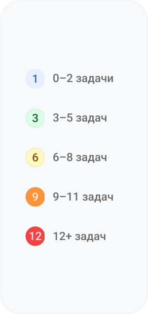


I added a tooltip explanation because I had not seen this feature in competitor products, and not every user would immediately understand what it means.
This simple solution removes the need to open the employee’s full profile unnecessarily.
Employee Card
I chose a sidebar format instead of a separate page so the user would not lose focus. The sidebar works as a supporting layer over the main workspace — this lets the user explore a colleague’s profile while staying in the context of their current task.

The card is designed around hierarchy. Quick information that most users need is placed at the top. Below it, there is extended information, task analytics, and the employee’s development history.

Contacts
The user can immediately find the employee’s phone number, email, working hours, or location.

Active Tasks
A block for evaluating workload: which tasks are currently in progress, their complexity, priorities, and which projects they belong to.

Projects
Shows which projects the employee is involved in and how far along they are.

Skills and Competencies
This block is especially useful for HR, leads, and managers when they need to understand whether an employee is a good fit for a specific task or project.

Achievements
I created a visual achievements block with a light gamification format, which helps users quickly understand the employee’s key accomplishments.

History
This block is useful for HR, leads, and new team members who need to understand the employee’s journey, growth, and participation in important events.
Result
Instead of a separate screen, I designed an end-to-end tool that adapts to the needs of different roles in the product. Splitting the experience into a mini card and a sidebar made it possible to include as much useful data as possible without overloading the interface or adding unnecessary navigation.
As a result, it became more than just a UI component — it turned into a ready-made system pattern for a corporate environment that saves employees time and can be easily scaled for new types of data.
VAYTI
A job-tech platform for job search and career preparation. I designed the key flows, interfaces, and visual system of the product from scratch.
